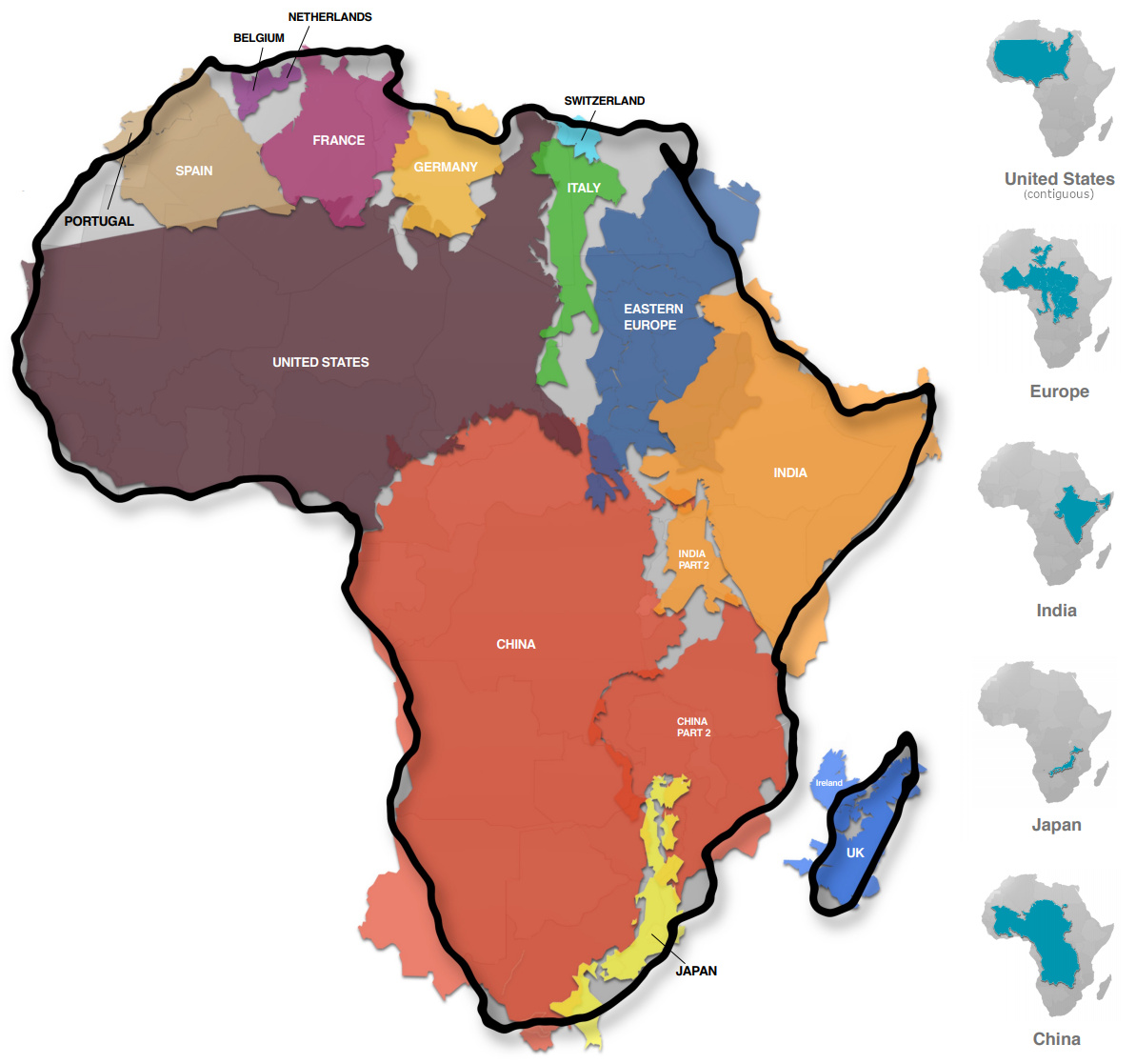
Africa lies between the Atlantic and Indian oceans, a vast continent of deserts, mountains, rivers, and thick forests. It is home to 1.4 billion people and stretches across nearly 30 million square kilometres. Yet, for decades, the Mercator map has shrunk it to a tiny shape on the page, while inflating North America and Europe. This isn’t just a mistake in geometry. It’s a reflection of a hidden global hierarchy, one that suggests some continents are superior to others. Despite Africa’s size and beauty, generations of Africans, including myself, have grown up seeing this false image.
From classrooms in Lagos to Casablanca, Cairo to Addis Ababa, Nairobi to Lusaka, and Windhoek to Cape Town, the same lie is taught. Why? The Mercator map, which was originally designed centuries ago for sailors, has long distorted Africa’s true size and shape, misplacing borders and undermining its richness and worth. But now, a shift is taking place. Africans are raising their voices, calling on the world to see and accept Africa as it truly is. The African voice rings loud and clear. The way Africa is represented on maps has always been beyond mere geography; it shows who controls the story of the world.
The Mercator Map
Flemish cartographer, Gerardus Mercator, in 1569, created the revolutionary Mercator projection to assist sailors in navigating. Although it provided an accurate compass, this mathematical innovation came with a high cost. Equatorial regions like Africa were distorted in both size and scale. While Europe and North America were grossly expanded, Africa was squeezed like a piece of poor sketching on the Mercator map. This map, which became popular during the colonial period, used visuals to create hierarchical borders that marginalised and pushed Africa to the bottom of the list of continents. Achille Mbembe, a Cameroonian philosopher and political scientist, argues that the colonial narrative encouraged and shaped this visual dominance that ultimately defined how Africans were seen and valued. 14th August 2025, is a day in History that will be forever etched in the heart of Africa. The African Union (AU), representing 55 nations from the continent, unapologetically endorsed the “Correct the Map” campaign, a movement spearheaded by two advocacy groups, Africa No Filter and Speak Up Africa.
They demand that the Mercator map projection be totally abandoned. In its place, they propose the Equal Earth map. This signals a recovery of agency, asserting that Africa, its size as well as its richness, be honoured without restraint. This demand, they insist, must move beyond paperwork to policy-making, education and media. The deputy chairperson of the AU commission, Selma Malika Haddadi, clearly said, “The prevailing map perpetuates a falsehood that diminishes Africa’s stature despite it being the world’s second-largest continent with over a billion inhabitants.” This resonates because history has clearly shown that the visual misinterpretation of the Mercator map is not an oversight but a deliberate implementation of a global narrative that reshaped decisions in governance, policymaking and investment. Moky Makura, executive director of Africa No Filter, agrees that the Mercator map was “the longest-running misinformation campaign.” Hence, Africans’ perceptions of the world and their place in it were influenced by this distorted map, which was institutionalised across the continent through colonial education systems and missionary schools.
Impact on Perception
The African Union’s historic support is now being reinforced by more global efforts to correct map distortions. The Gall-Peters and AuthaGraph maps are gaining popularity because they show landmasses in their true proportions. These projections are now part of efforts to change the way people think about things in schools and in public campaigns that aim to undo centuries of false images. UNESCO backs the push for “cartographic decolonisation,” asserting that accurate maps do more than fix geography; they restore cultural dignity and affirm everyone’s right to see themselves clearly. These efforts work together collectively to create a strong, coordinated movement to place Africa where it belongs: in the middle of the world’s geography and imagination. Although Equal Earth is more classroom-friendly because it strikes a balance between realism and aesthetic appeal, the Gall-Peters map maintains area proportion.
The African Union’s historic support is being followed by more global efforts to fix map distortions. The Gall-Peters and AuthaGraph maps are gaining popularity because they show landmasses in their true proportions. These projections are now part of efforts to change the way people think about things in schools and in public campaigns that aim to undo centuries of false images. UNESCO backs the push for “cartographic decolonisation,” saying that accurate maps do more than fix geography; they restore cultural dignity and affirm everyone’s right to see themselves clearly. These efforts work together to create a strong, coordinated movement to put Africa where it belongs: in the middle of the world’s geography and imagination. Although Equal Earth is more classroom-friendly because it strikes a balance between realism and aesthetic appeal, Gall-Peters maintains area proportion.
Why Mercator Persists
Despite more people becoming aware of its flaws, the Mercator projection continues to be the most popular world map in schools, the media, and official locations. This persistence has more to do with long-standing tradition, convenience, and hidden power dynamics than with geographic accuracy. For decades, the Mercator map has been the standard classroom picture. It is well-known and used in schools all over the world. Changing it means rewriting textbooks, retraining teachers, and going against long-standing cartographic standards. This is not an easy task for even the sincerest educational systems. “Changing entrenched educational materials and curricula is slow and challenging due to institutional inertia and economic constraints,” as African geographer and education advocate Dr Musa Mwangi explains in African Leadership Magazine (2025). Retraining, resources, and overcoming ingrained Eurocentric norms are necessary for efforts to adopt more equitable map projections.
His finding supports the idea that the Mercator projection persists not because it is true but rather because it is ingrained into the systems that propagate and teach it.
The Mercator projection additionally promotes powerful countries. By making Europe, North America, and other rich areas look more significant, it demonstrates that they are the most powerful regions in the world. On the flip side, continents near the equator, particularly Africa, appear smaller, and this reflects and solidifies past inequalities. This visual hierarchy is not neutral; it discreetly alters how people view political importance, economic potential, and cultural relevance.
As efforts to promote alternative proportional area projections gain popularity, they encounter objections from groups afraid to abandon familiar tools and from interests dedicated to upholding existing worldviews. More than 80% of world maps in textbooks still use Mercator, which will keep this inaccurate view of the world alive for future generations. To break the cycle and make room for more honest, inclusive maps, it’s important to understand why Mercator continues to exist.
The Mercator map’s distorted shape is a reminder of Africa’s colonial history of territorial disintegration. During the historic Berlin Conference of 1884–1885, European powers came together to divide and seize African lands without engaging the African populace. The visual deformation resulting from the Mercator projection and this act of geopolitical cutting are each instances of external impositions that destroyed Africa’s identity and sovereignty. Political instability and economic exclusion continue to be affected by the conference’s legacy of unjust boundaries alongside exploitation.
Similarly, the Mercator map’s inflation of Europe and diminishing of Africa reinforces lingering colonial attitudes. The African Union’s deputy chairperson, Selma Malika Haddadi, emphasises that this visual narrative sidelines Africa, shaping perceptions in investment, media, and policy decisions. The map’s distortions are not mere cartographic curiosities; they are active elements sustaining global inequalities.
Forward-Looking Perspective/ Going Forward
Africa’s actual size is now a question of sovereignty, identity, and just how the continent will define its future as opposed to mere geography. A movement to solidly establish Africa at the centre of the world’s map, as well within the global consciousness, is gaining momentum even as the effects of colonial-era biases continue to be felt. Regaining dignity and shifting how Africa is viewed and appreciated are now more important than simply fixing mistakes on documents.
The Classrooms are where real change starts. A generation that recognises Africa as a dynamic, key player on the global stage rather than as a fading shadow can be nurtured by including accurate map visualisations, such as the Equal Earth map, into the curriculum of schools. As Dr Amina Sefu, an education Specialist from Kenya, explains, “Integrating fair and accurate map projections in school curricula empowers African children to perceive their continent as a vital and influential global player, fostering pride and reshaping identity”, reports CorrectTheMap.org.
Governments, educational institutions, and international organisations, ranging from local schools to the United Nations, are encouraged to adopt equitable representations through campaigns like “Correct the Map” and groups like Africa No Filter. These initiatives are designed to permanently rebalance how Africa is viewed and valued via educational reforms, media diversification, and public awareness campaigns. Some African ministries of education are already piloting the Equal Earth projection in primary schools to realign learning materials.
This shift from distorted maps to fair representation is an indicator of Africa’s broader ascent in general, a continent taking back its history, demanding equality, and transforming its position in global politics. The present moment urges us all to embrace maps as dynamic tools that symbolise justice, value, and our common humanity rather than as timeless facts.
Conclusion
Returning to my initial misunderstanding about how big Africa was on a map, this journey has shown that maps are never entirely abstract representations. They influence our understanding and appreciation for continents, people, and cultures by transferring identities, stories, and influence. Regaining pride, dignity, and a voice are now more crucial than geography when it comes to correcting the distorted boundaries that have long diminished Africa.
Redesigning the map is more than a visual correction, it is a step towards rewriting stories that have been buried and excluded for centuries is redesigning the map. It is an appeal to the media, policymakers, educators, and world citizens to acknowledge the actual scope and value of Africa. It encourages humanity to look at the continent differently compared with map projections, recognising its diversity, resiliency, and global significance. As new generations grow up learning from fairer maps, and as institutions embrace change, Africa’s story will no longer be a footnote or distortion in the global narrative. It will be a defining chapter, bold, proud, and unmistakably at the centre.
Restoring respect, repairing historical harm, and reaffirming Africa’s pivotal position on the global scene all depend on this continuous endeavour to present Africa’s true image on the map. “The most important step towards reclaiming our history and future is decolonisation of the mind,” as Ngugi wa Thiong’o reminds us. Only then can Africa completely recover its story and rightful position in the world’s consciousness. Indeed, Africa is already positioned in its rightful place, at the center of the world, ensuring the next generation need not reconstruct the maps to find it.